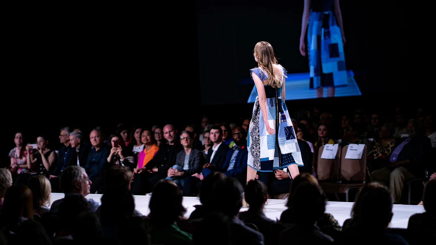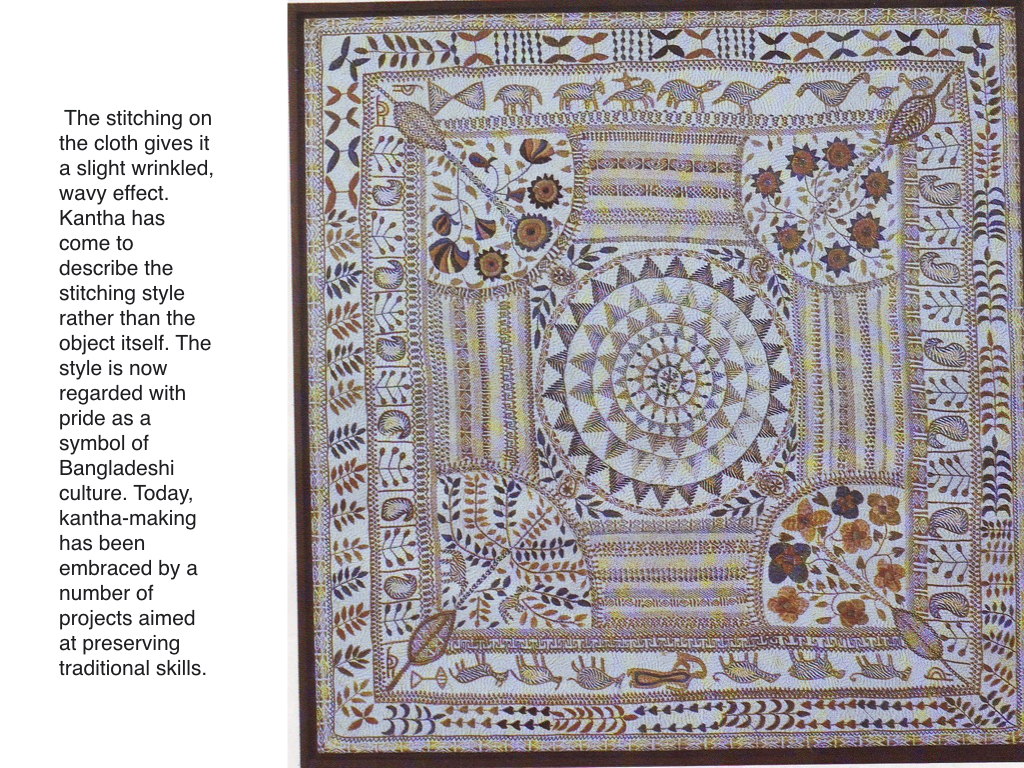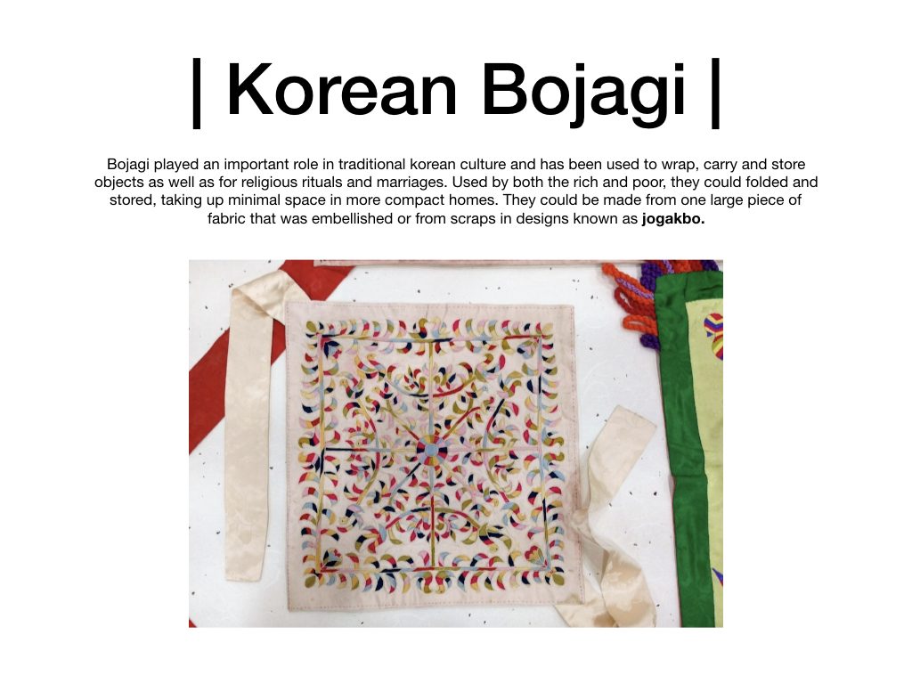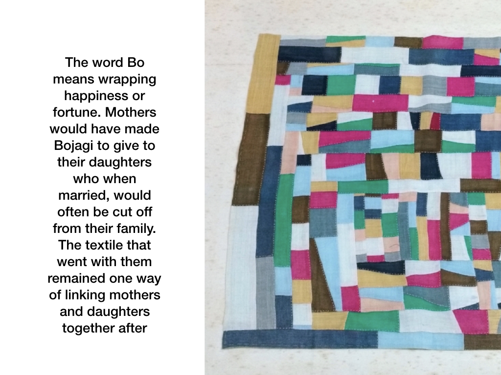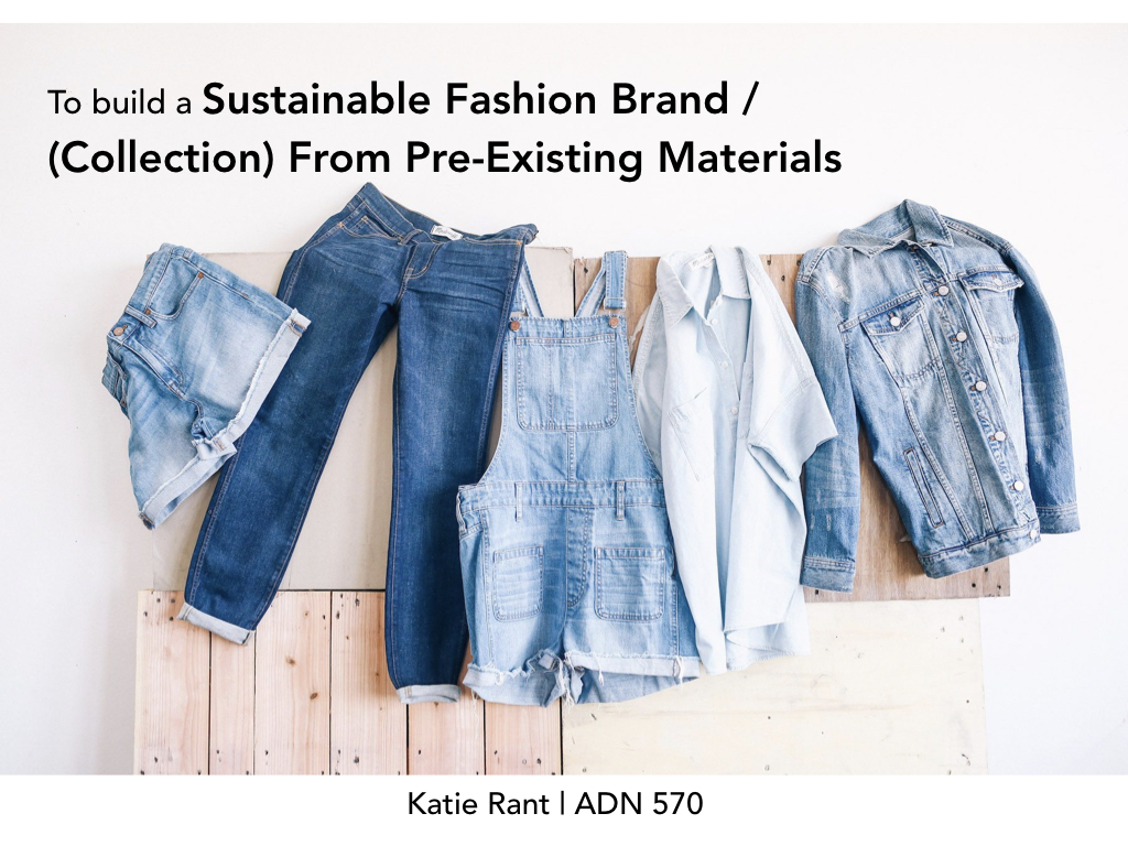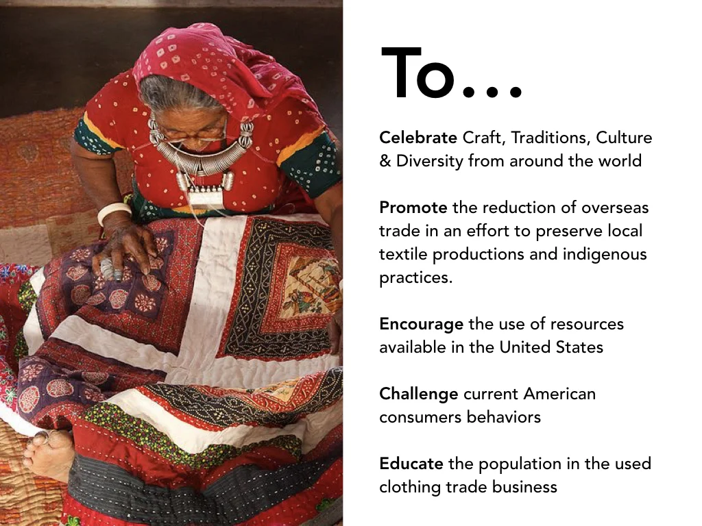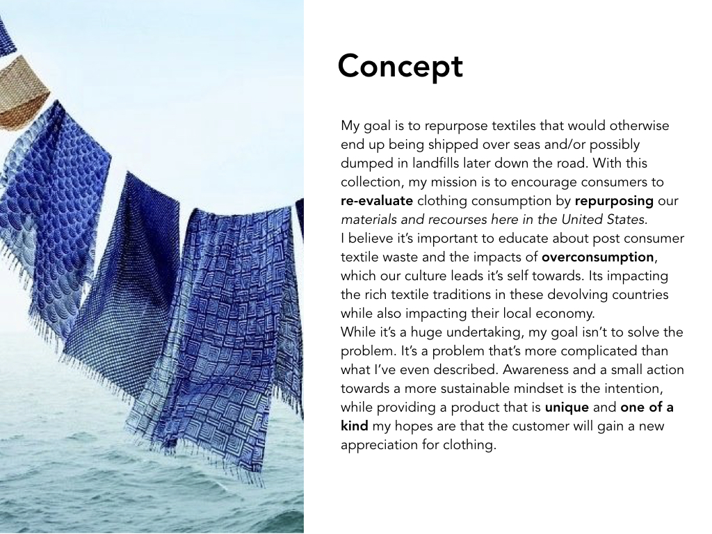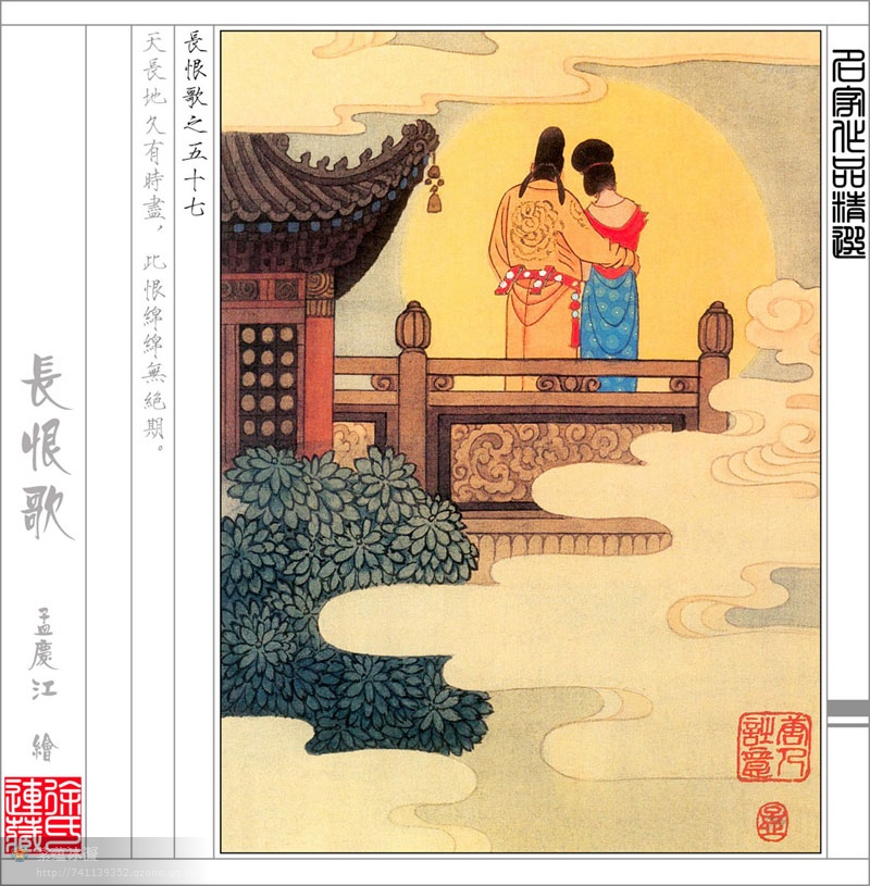
Words as Character
Typography communicates meaning. It also expresses it. This project explores they many ways text can express meaning both visually and textually. Imagining the word literally, as a character on a stage, these composition studies demonstrate how spacing, proximity, scale and repetition can visually speak the meaning of a word.
Composition Constraints/ Requirements:
The composition set would include four words total.
Two words were assigned.The third word is a neologism we would create by combining the two previous words together. The fourth word was our choice. We could only use the letters in the word. The only typeface we could use was Univers. Warping and distorting the letter form was not allowed.
Assigned Word
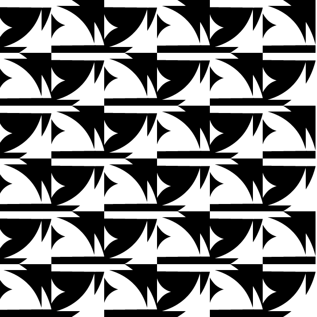
Set 1
Set 1
Set 1
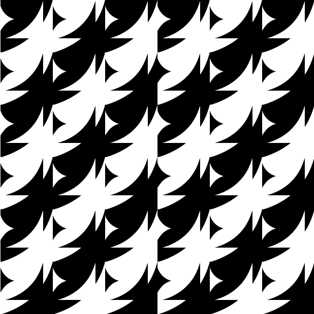
Set 2
Set 2
Set 2
Set 2
Set 2
Set 2
Set 2
Set 2
Set 2
Set 2
Set 3
Assigned Word
Set 1
Set 1
Set 1
Set 1
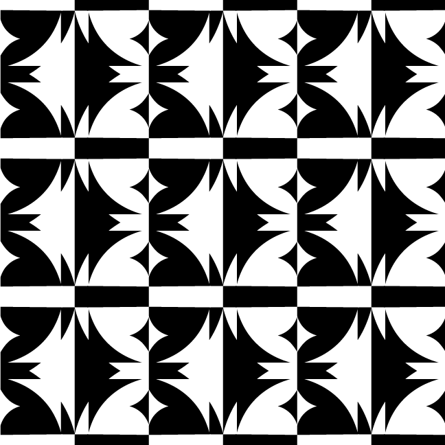
Set 2
Set 2
Set 3
Set 3
Neologism
Set 1
Set 1
Set 1
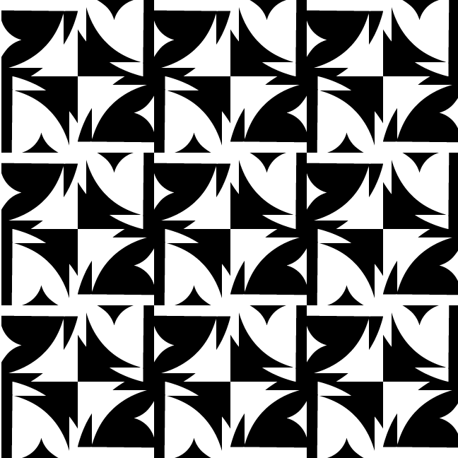
Set 2
Set 2
Set 2
Set 2
Set 2
Set 2
Set 2
Set 2
Set 3
Set 3